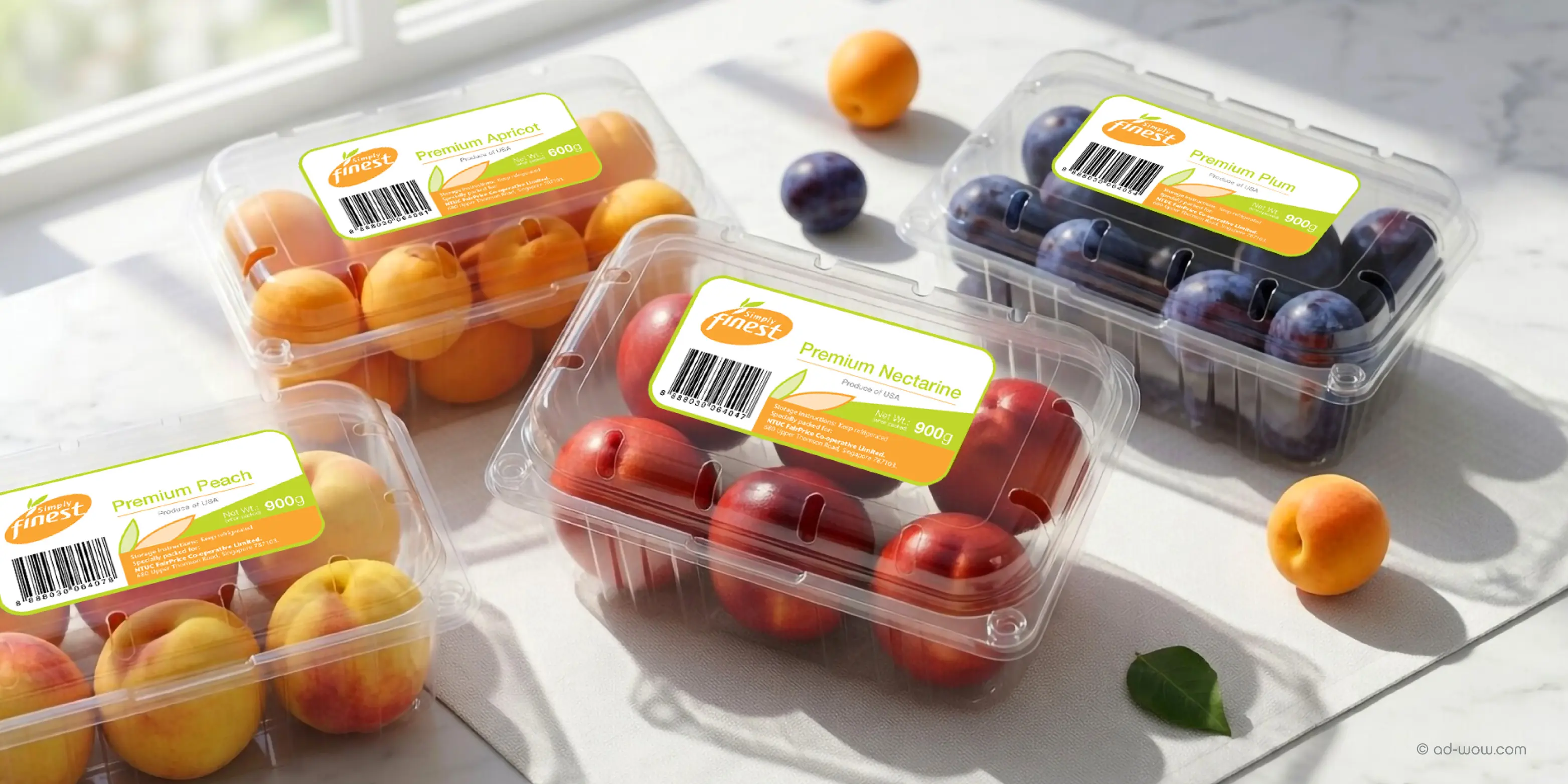
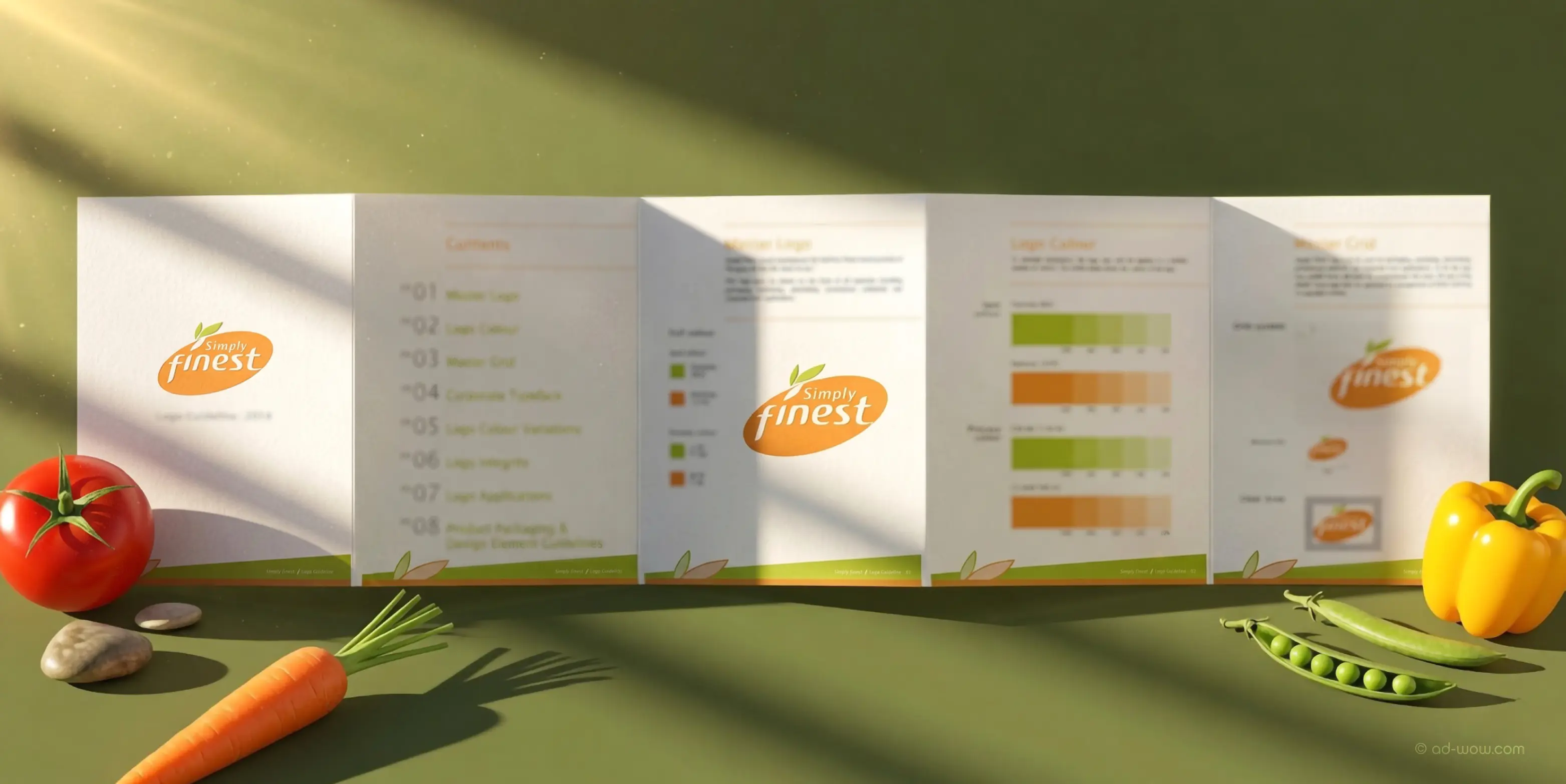
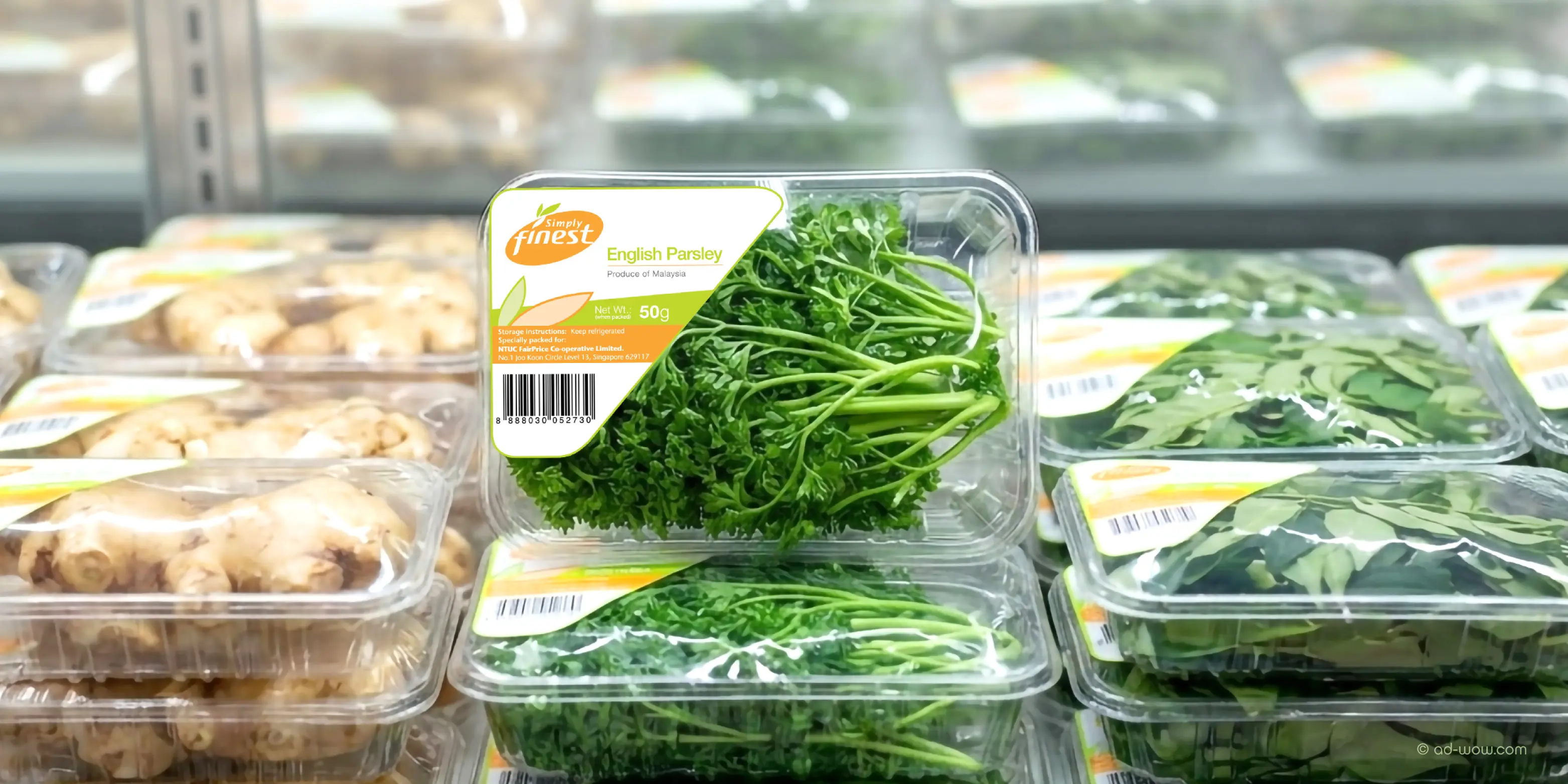







Simply Finest Packaging Design & Brand Identity Case Study. As NTUC FairPrice's value-driven fresh produce brand, Simply Finest is built around everyday affordability and consistent quality for Singapore shoppers. ADWOW developed Simply Finest's brand identity, brand guidelines, and a comprehensive suite of packaging labels spanning pre-packed vegetables, fruits, festive Chinese New Year orange boxes, and sticker designs, creating a cohesive visual language engineered for shelf visibility. From everyday vegetable and fruit labels to CNY festive packaging, each design element was developed to strengthen brand recognition, simplify SKU navigation, and reinforce shopper trust at the point of purchase—positioning Simply Finest as a scalable, retail-ready identity and a dependable everyday choice in Singapore's competitive grocery market.
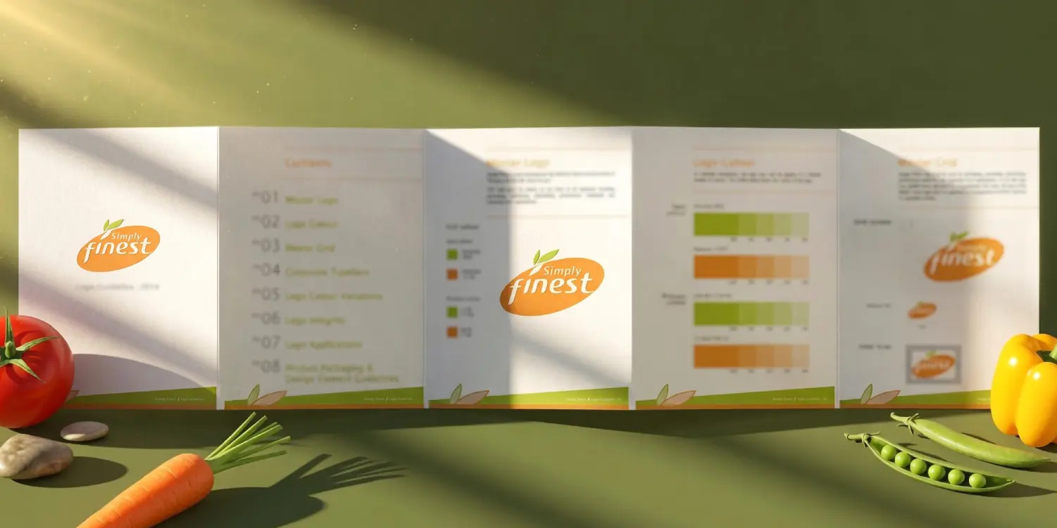
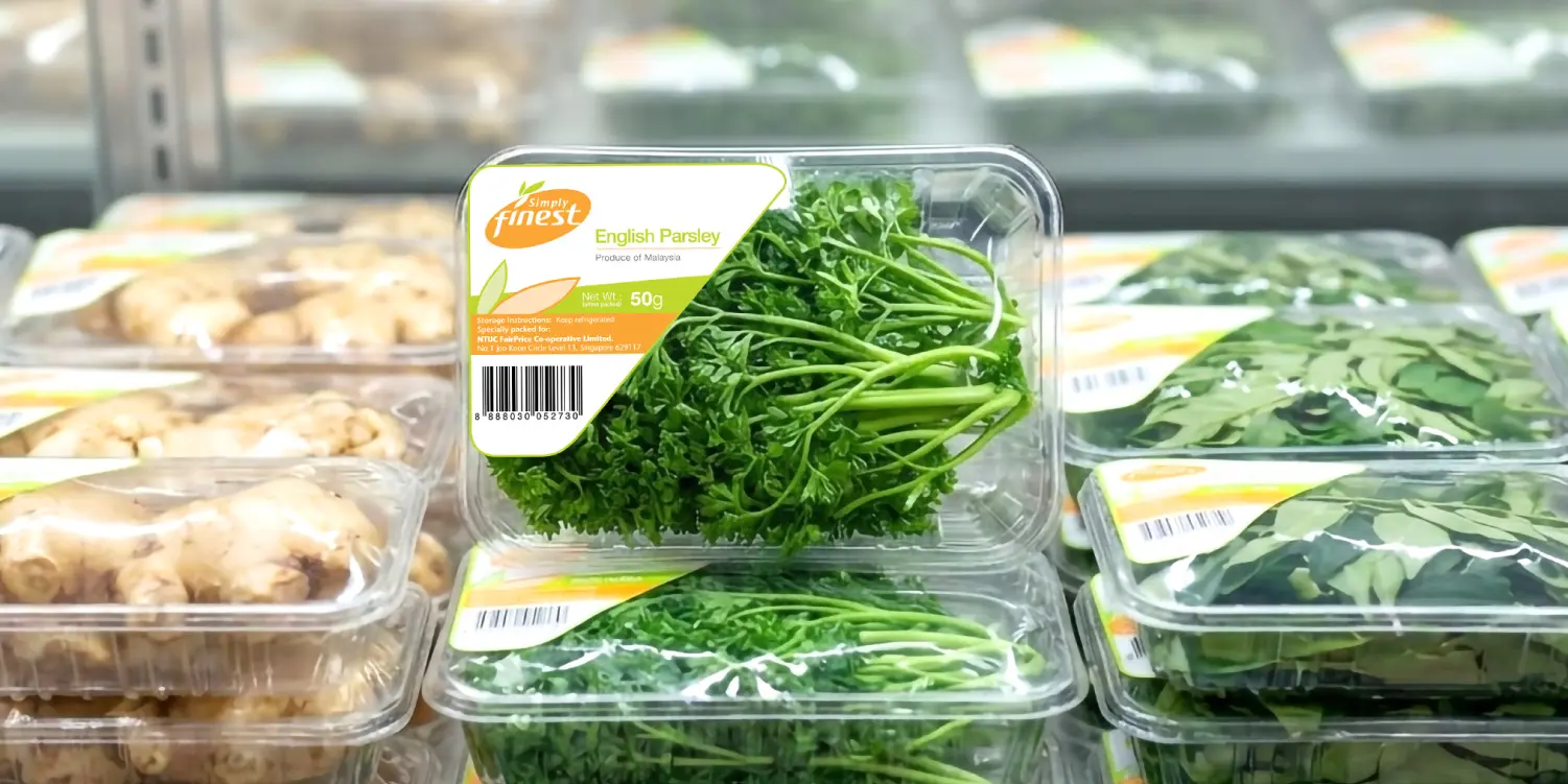
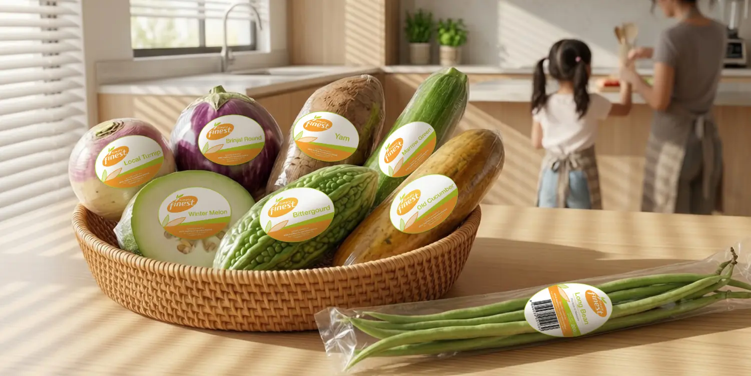
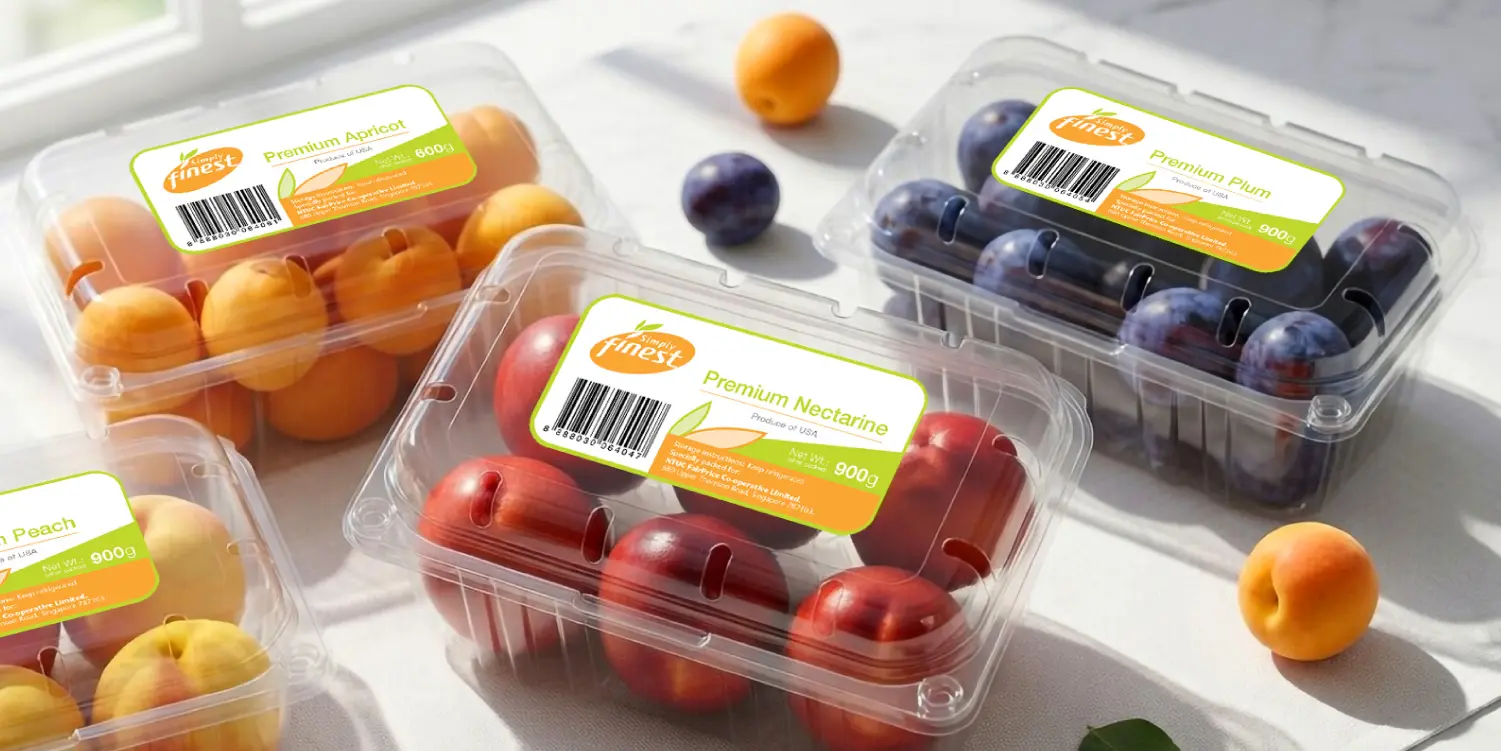
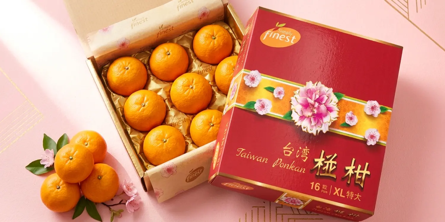



ADWOW developed Simply Finest's logo design, brand identity guideline, and a full packaging label suite covering vegetables, fruits, festive CNY packaging and sticker designs for NTUC FairPrice.
Simply Finest is a house brand owned by NTUC FairPrice, positioned as a value-driven, everyday-affordable fresh produce range for Singapore shoppers.
Packaging is a shopper's first touchpoint with the product and directly shapes perceived quality and trust at the shelf — a principle applied across every category in the Simply Finest range, from pre-packed produce to festive editions.
The system spans logos and identities, brand guidelines, range-of-packaging formats, festive packs (such as the CNY orange box), sticker designs, and vegetable and fruit label designs — all built on one cohesive visual language.
ADWOW has partnered with NTUC FairPrice and its house brand portfolio, including Simply Finest, for more than two decades, delivering packaging design and brand identity systems across Singapore's retail market.